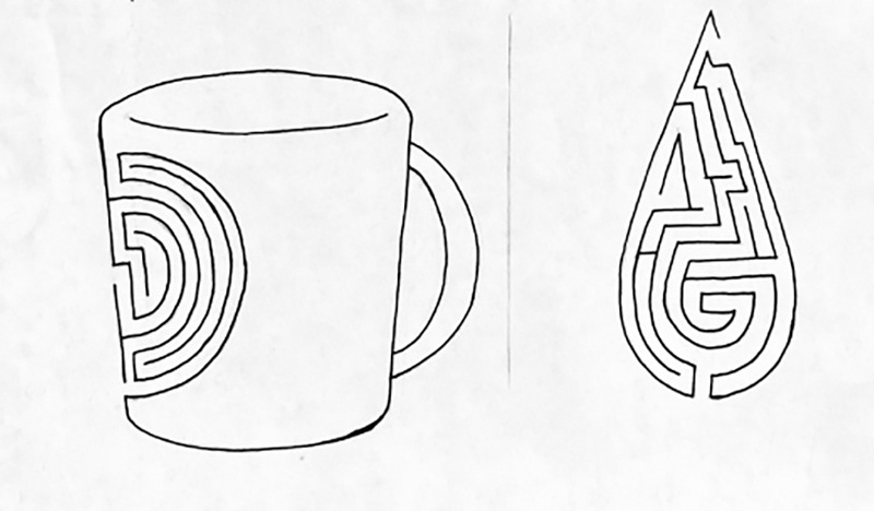
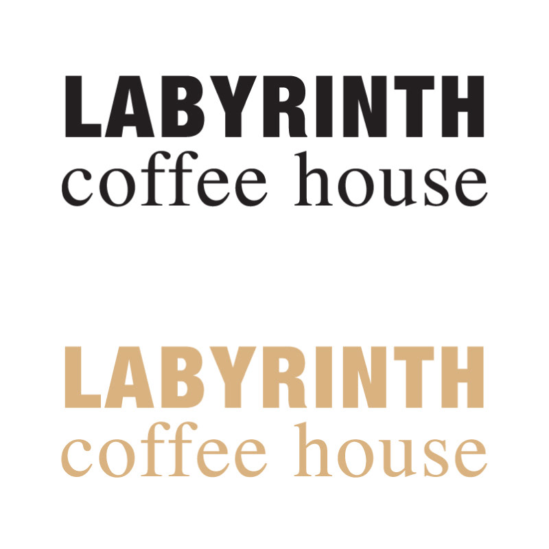
A logo redesign for Labyrinth Coffee House was created for a clearer expression of the brand. Two possible marks were chosen from the sketches and enlarged.
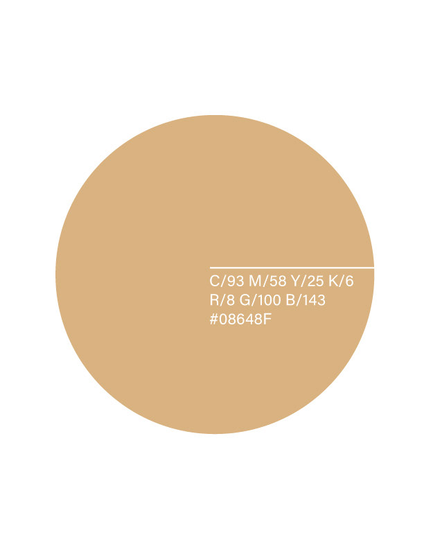
A light brown color, because of its likeness to coffee, was selected.
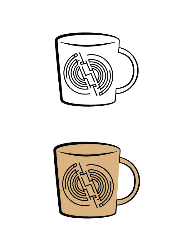
The two marks were then drawn in Illustrator, with both in the light brown, and set again in black and white.

The name is in condensed and bold Helvetica Neue, while the descriptor is Regular Times.
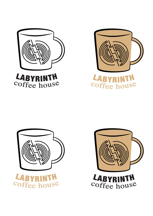
Examples of the logos and mark with color combinations.

____________________
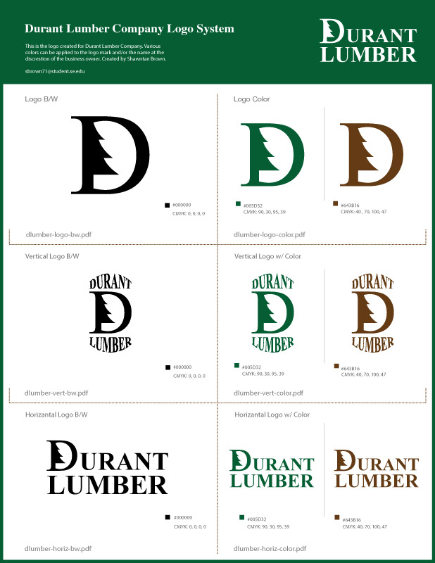
The mark redesign and logo system created for Durant Lumber Company, with a regular Times New Roman typeface.


____________________
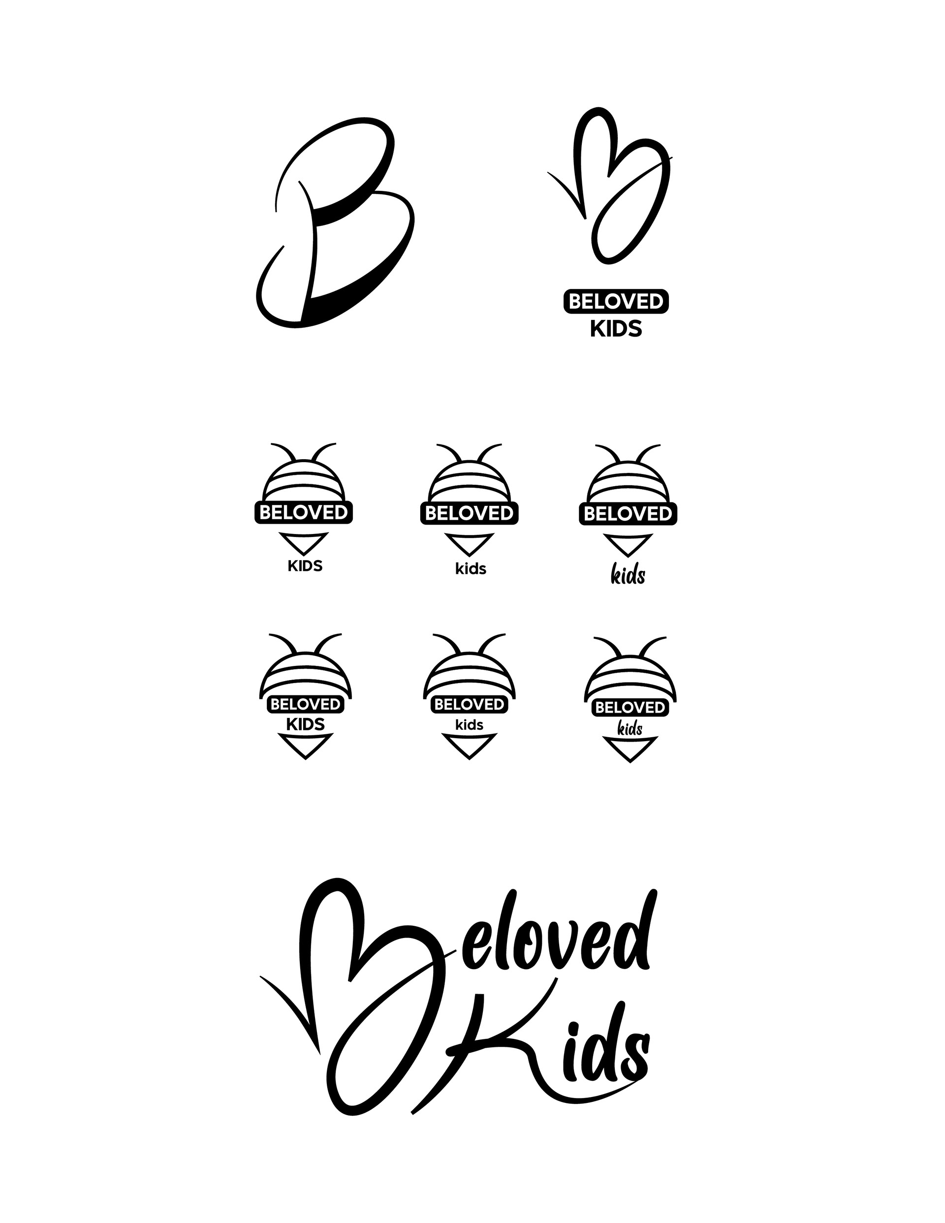
Beloved Kids Daycare
____________________