1. Notable Paper Company
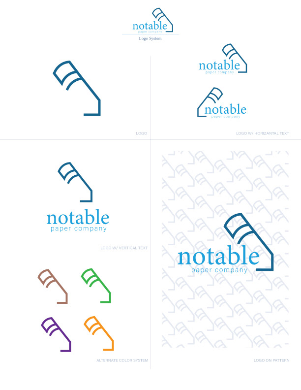
First is an image traced version of the initial sketch. The mark is of an abstract pencil, that was simplified further to have missing line segments. This was to suggest openness, and the limitless potential of a blank page. Below the draft is the mark, made with thicker lines, in a cooled shade of blue. Productivity, calmness, and dependability were the intended word associations.

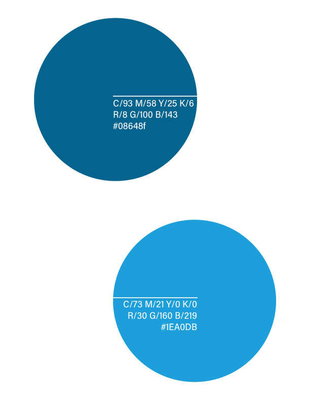
The colors were chosen to show a contrast between a peaceful shade and an energetic tint.
Two typefaces were selected for the combination logo's text. Minion Variable Concept set at regular was used for notable, as the text for books are often printed with a serif font. paper company is shown smaller in Acumin Variable Concept at default. Letterforms of the texts are round and open. Excluding the mark, the logo as a whole should appear quiet but active.

A logo system was created to show the mark in different formats and colors.
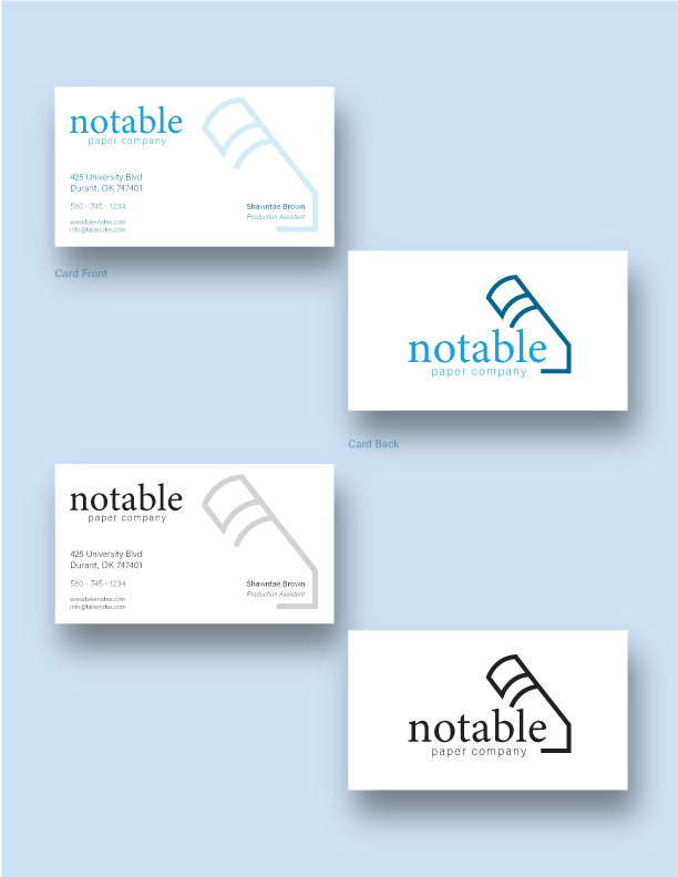
Then, landscape and portrait-style business cards were designed. Both designs were redone in black.

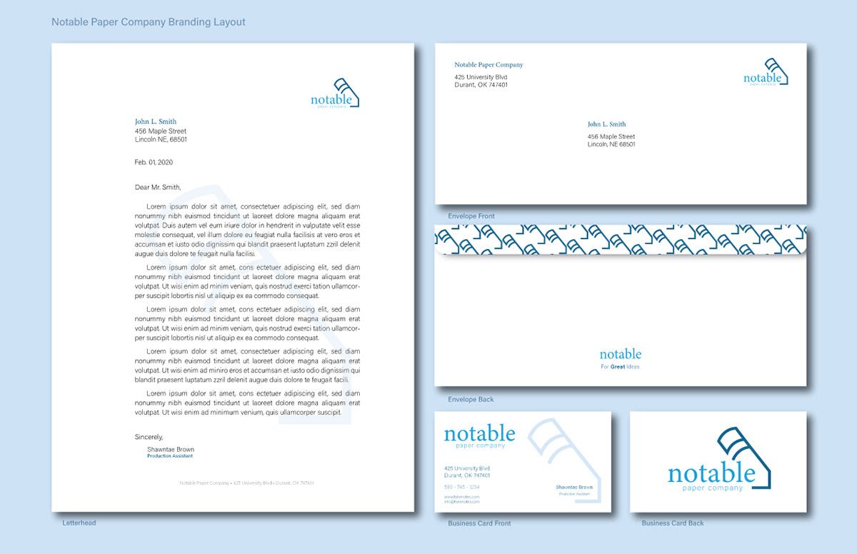
Branding layout was formed to show the design on stationery.

____________________
2. Avalon Consulting
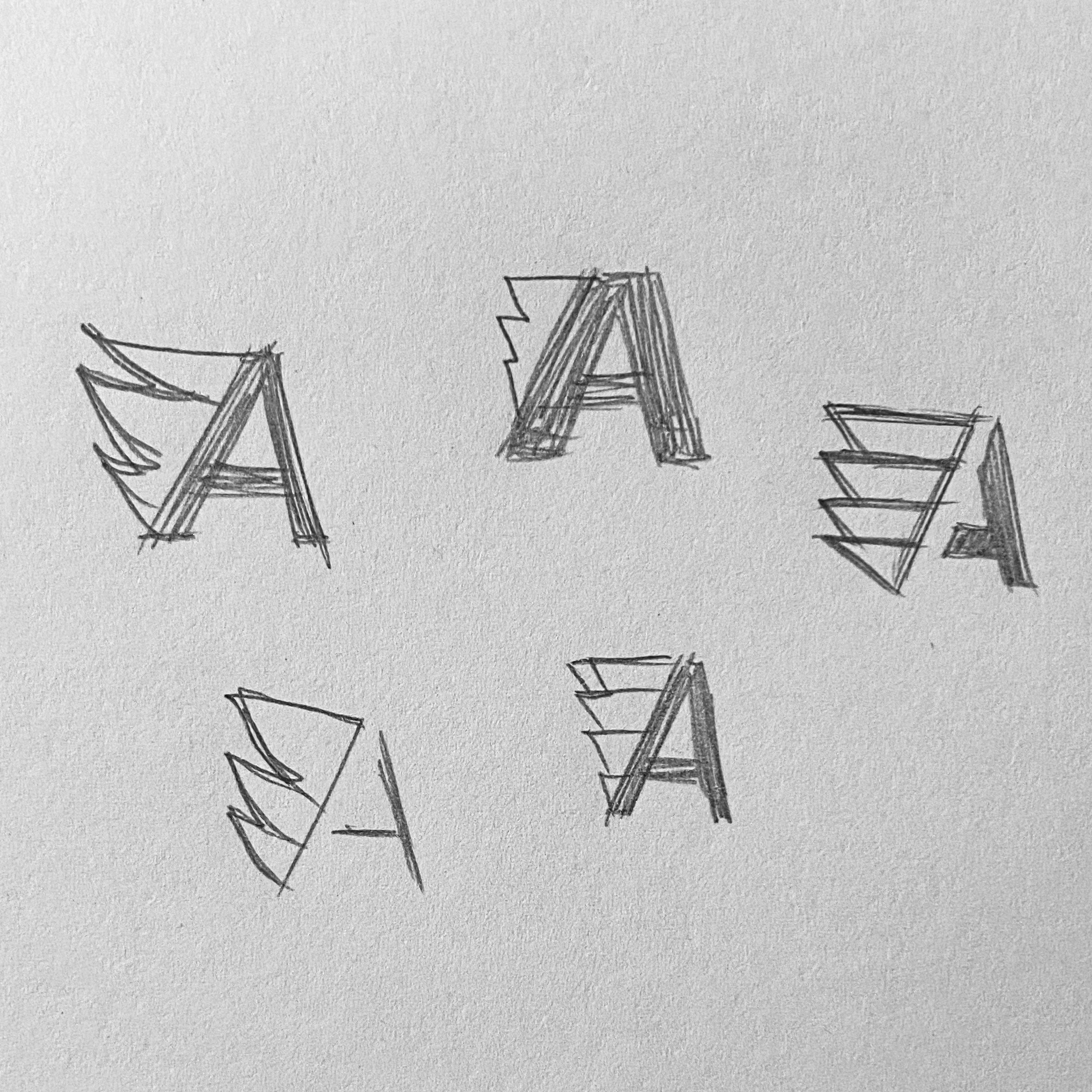
As I experimented with the form of the capital A, and wanted to replace the hairline with a graphic. I decided that an abstract wing made of triangles, to reflect the A, was good choice for cohesiveness. The dark and light blue colors were chosen in Illustrator to outline and differentiate sections of the logo.
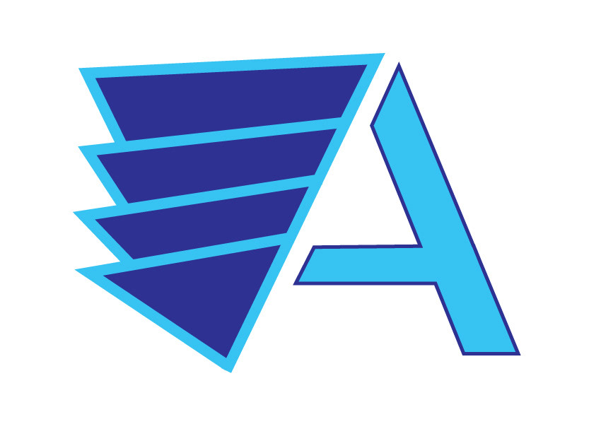
I saw that the thickness and sharpness of lines gave the mark a strong appearance, and felt that the light blue could be changed. The two examples of red below were selected for the mark and part of the text.
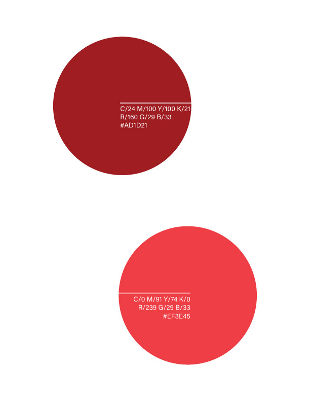
Only tinted red is seen on the mark, and having the strokes in dark red were difficult to see. White worked best at separating the mark from backgrounds.

The words were rearranged and set in two colors for contrast, though Baskerville is the only typeface used for the font. Avalon was altered to allow Consulting to sit close to the A, which is the focus.

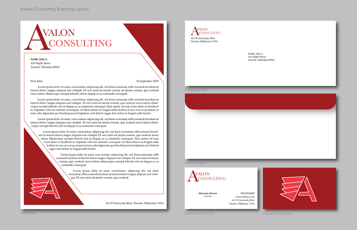
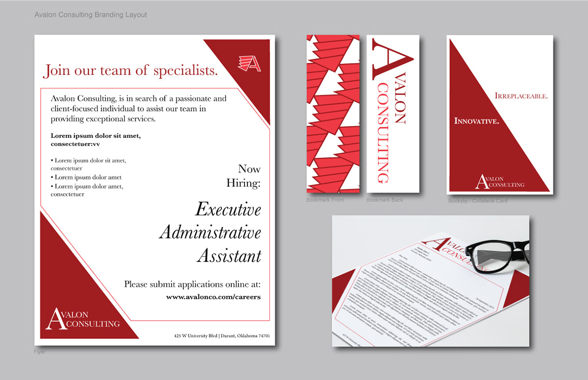
Lastly, a stationery layout was created for the mark and logo.
____________________
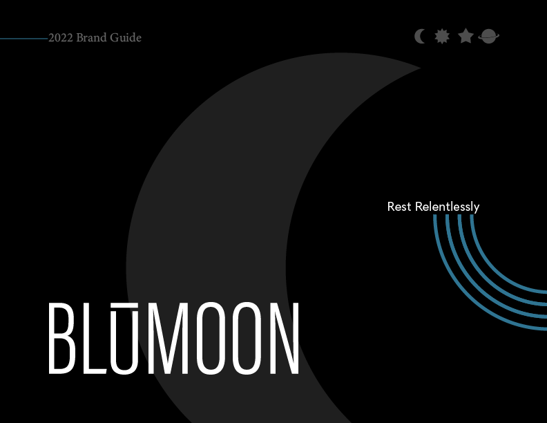
3. BLUMOON
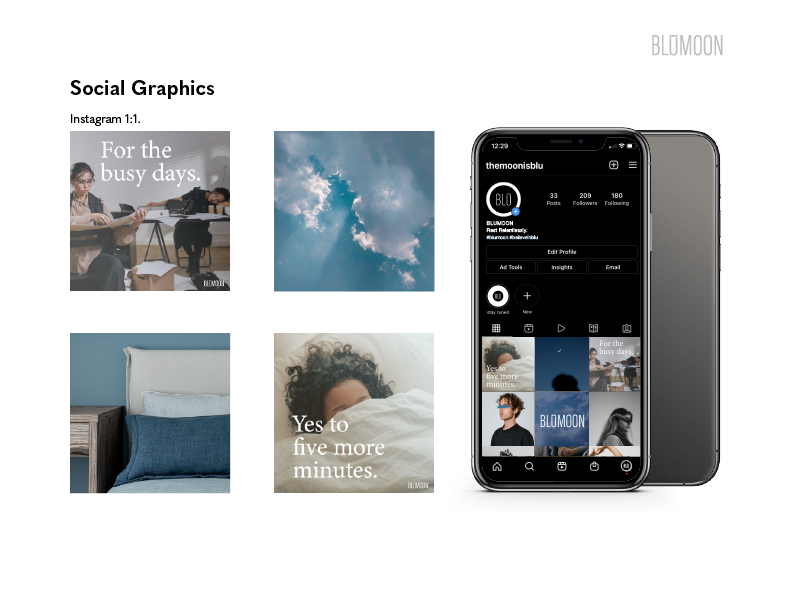
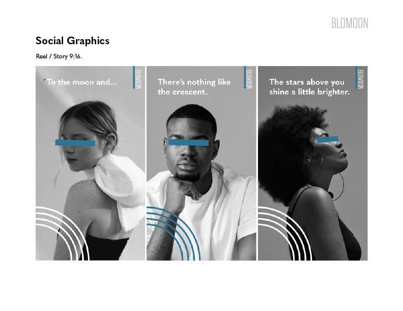
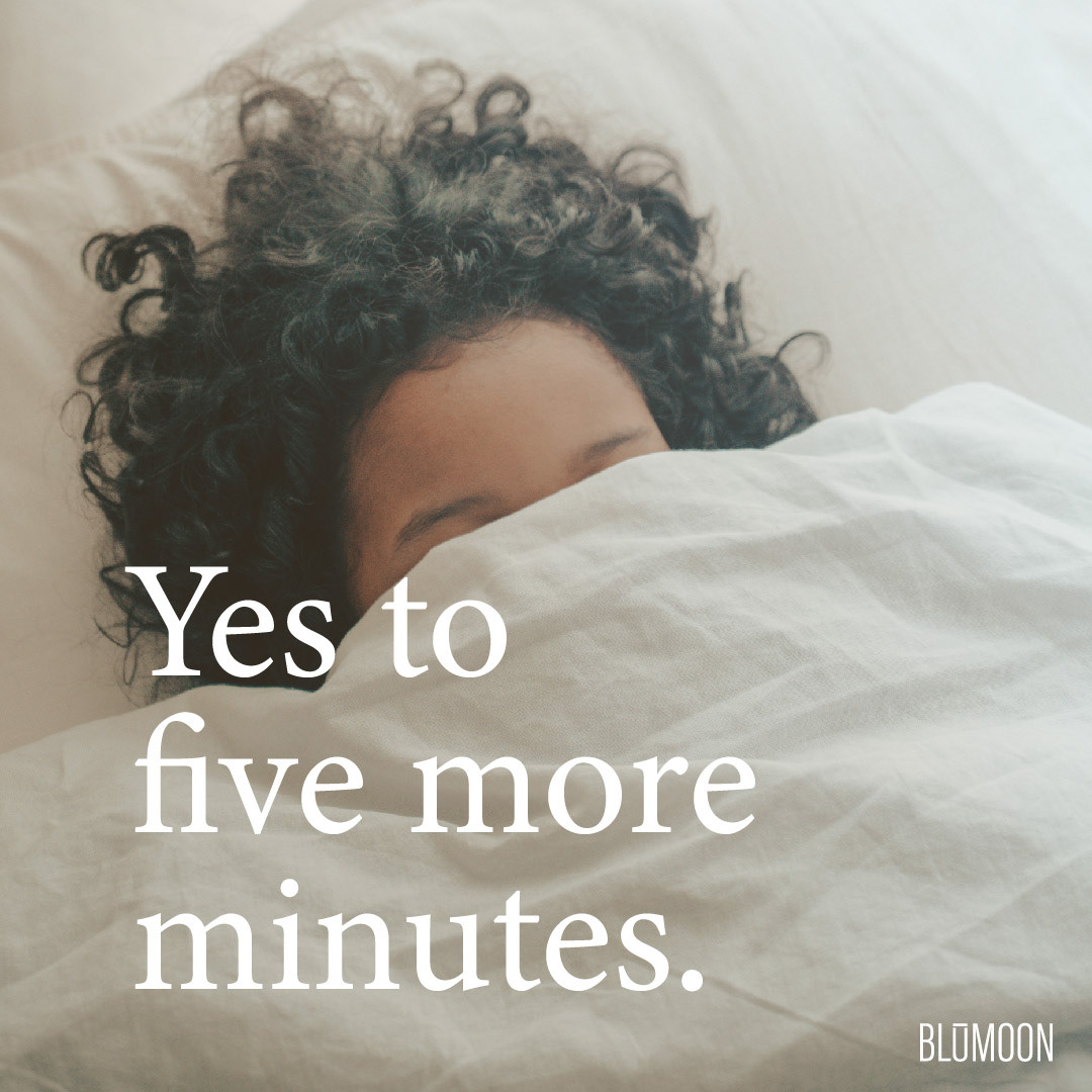
Social posts for Instagram.


____________________
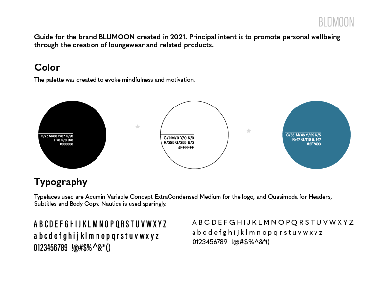
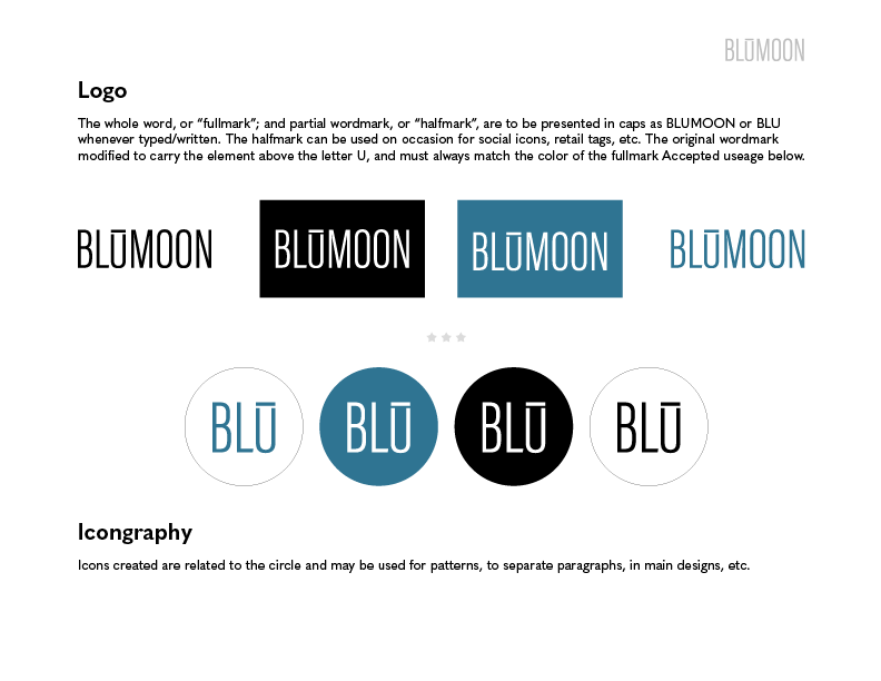
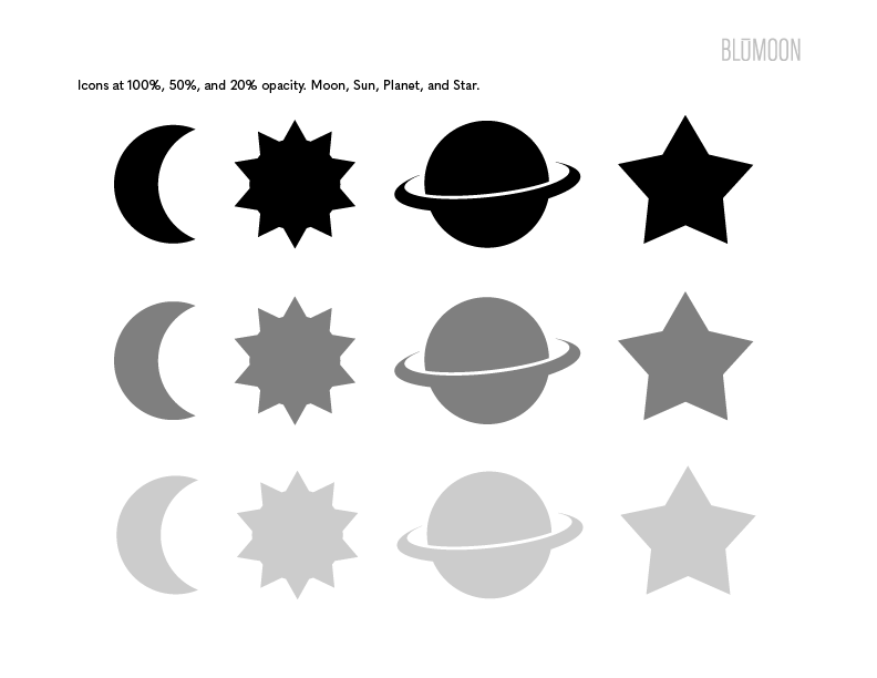
BLUMOON Brand Style Guide